01
NeuroVerse
Designing a concept mobile app in response to the Creative Conscience 2023 to 2024 awareness brief, focused on improving understanding and emotional support for neurodiverse individuals through music based therapy experiences. NeuroVerse explores how UX design can support emotional regulation, self expression and inclusion by making music therapy more accessible, affordable and user centred. The primary user interaction focused on guided music activities, sensory regulation tools and community engagement rather than clinical treatment, positioning the app as a supportive and empowering digital space.
Sector:
App Design
Industry:
Healthcare
Duration:
5 weeks
My Contributions
End to end UX and UI design across the full app experience, including:
UX research and problem definition
Desk research and qualitative insight gathering
Stakeholder engagement with professional music therapists
User persona and journey mapping
Information architecture and user flows
Low and high fidelity wireframing
Prototyping in Adobe XD
Illustration and visual UI design
Design system development
Tools used included Adobe XD, Illustrator and Photoshop.
The Design Process
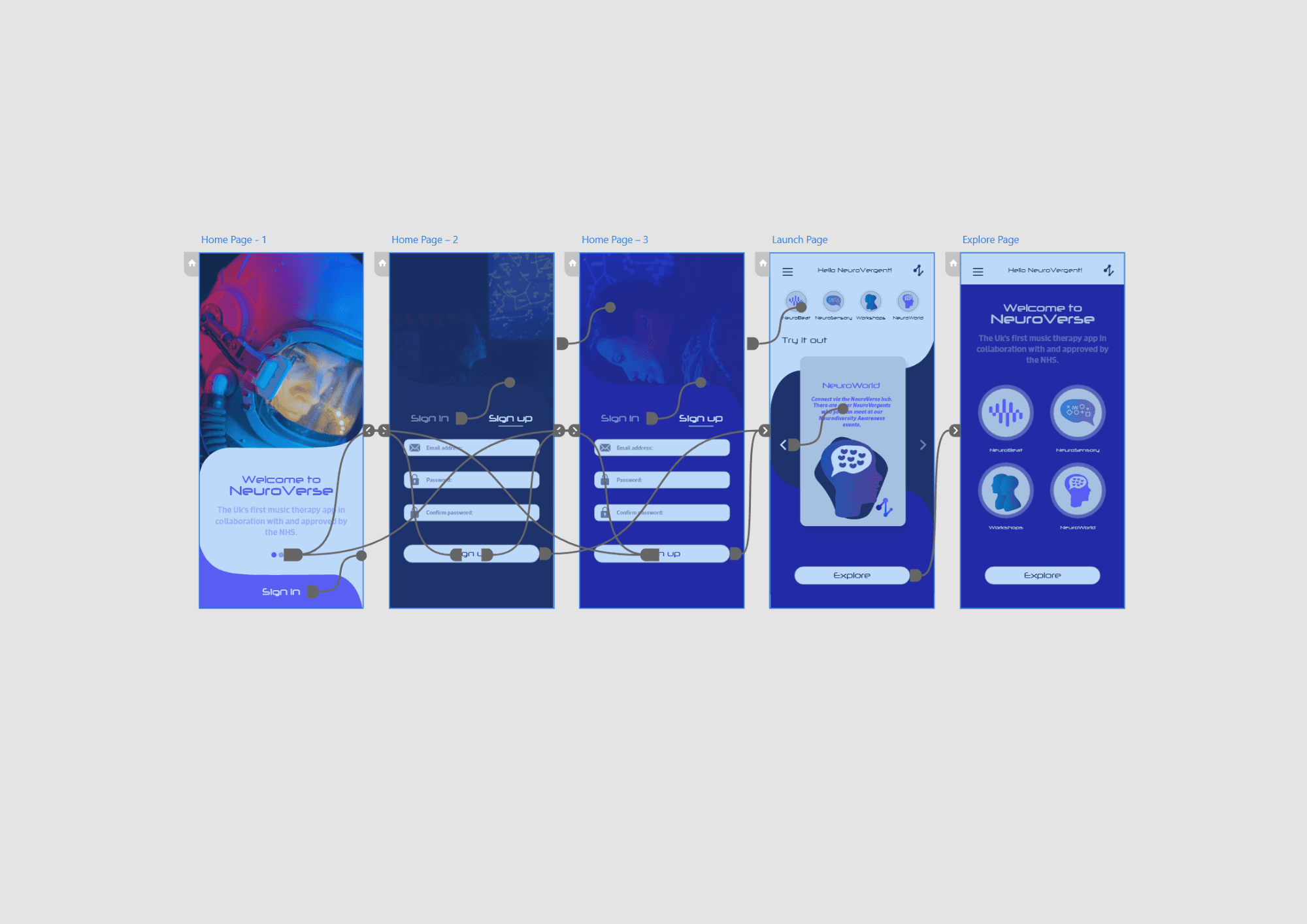
The project began by defining the core problem: the lack of accessible, affordable and music based therapy tools for neurodiverse individuals within existing wellbeing apps. Research highlighted that many platforms are either too clinical, too text heavy or restrict meaningful content behind paywalls.
I mapped the user journey from discovering therapy based apps to disengagement caused by long onboarding processes, limited access and sensory overload. Low fidelity wireframes were used to explore onboarding, workshop navigation and community features with a focus on reducing friction and cognitive load.
High fidelity designs refined these ideas into a calm, intuitive interface that prioritised emotional safety, flexibility and creative self expression through sound.
Design System
A cohesive design system was created to ensure consistency across navigation, workshops and community spaces. The system prioritised clarity, predictability and sensory comfort.
Design rules were established for colour usage, typography hierarchy, button styles and iconography to create a familiar and reassuring experience throughout the app. This consistency supports neurodiverse users who benefit from structured and predictable interfaces.
Typography System
Heading Hierarchy
A clear and minimal heading structure was used to guide users through workshops and learning content without overwhelming them. Hierarchy focused on clarity and gentle progression through tasks.
Body Text
Body text was designed to be readable and emotionally neutral, avoiding overly clinical language. Text density was carefully managed to reduce cognitive strain and support focus.
Interface Labels
Buttons and navigation labels were written and styled to feel supportive and encouraging, reinforcing confidence and ease of use during emotionally sensitive moments.
Colour Palette
The colour palette was intentionally built around calming blue and purple tones, informed by colour psychology research into emotional regulation and stress reduction.
Accent colours were used sparingly to highlight interaction states without causing sensory overload, supporting a therapeutic and safe visual environment.
Conclusion
The final outcome is a research driven UX concept that demonstrates how digital design can support neurodiverse users through music based interaction, emotional validation and community connection.
NeuroVerse reframes therapy as a creative and empowering experience, showing the potential of UX design to foster inclusion, understanding and meaningful emotional support.